The Most Magical Place on Earth had just completed its 50th anniversary celebration, and the question arose: What's next? With Yellow Shoes, Imagineering, and Digital teams gather together, we crafted a unified brand manual that worked for every department's needs and set a standard for consistency and uniformity across the resort.
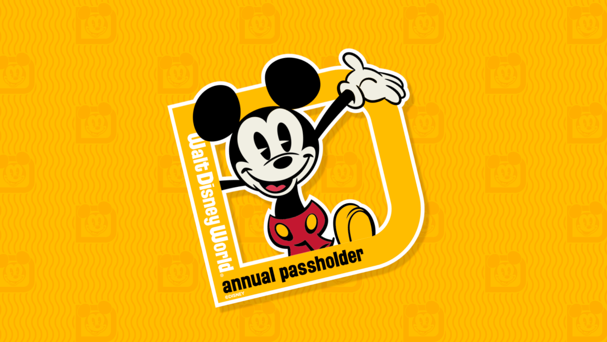
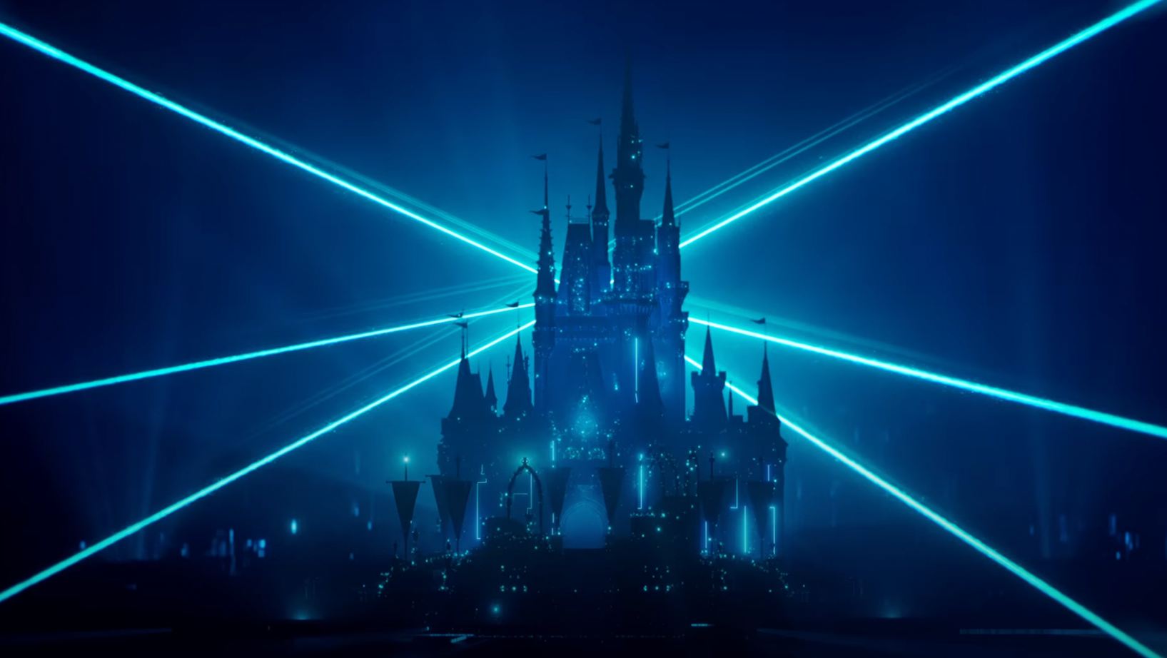
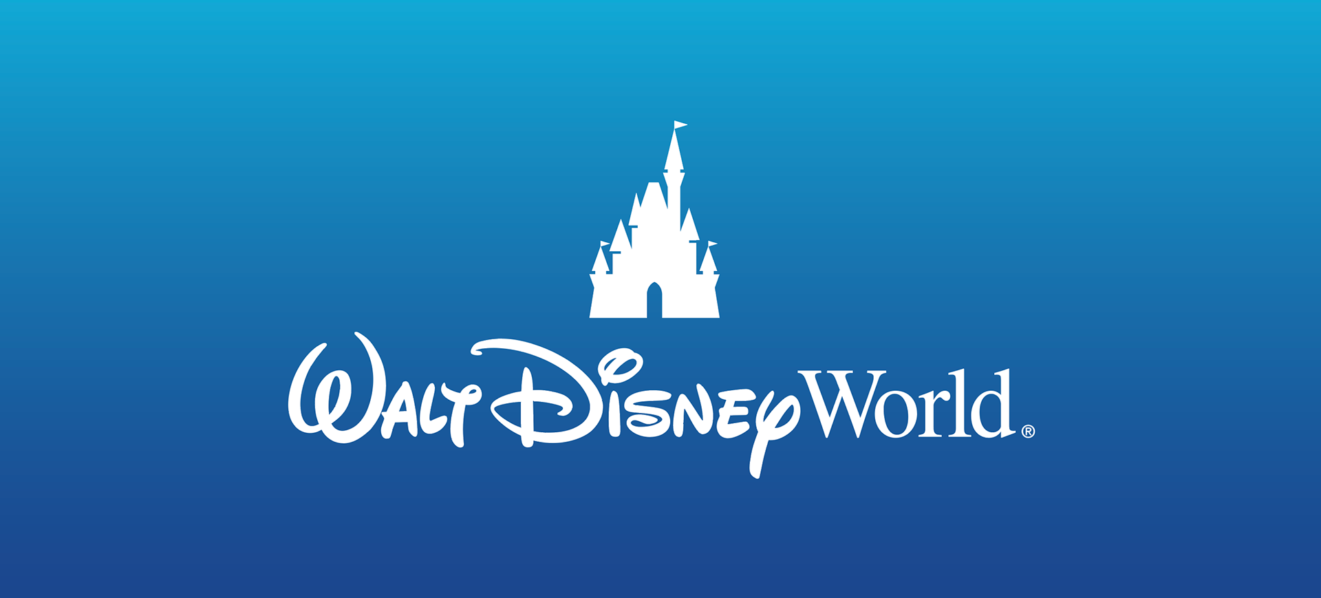
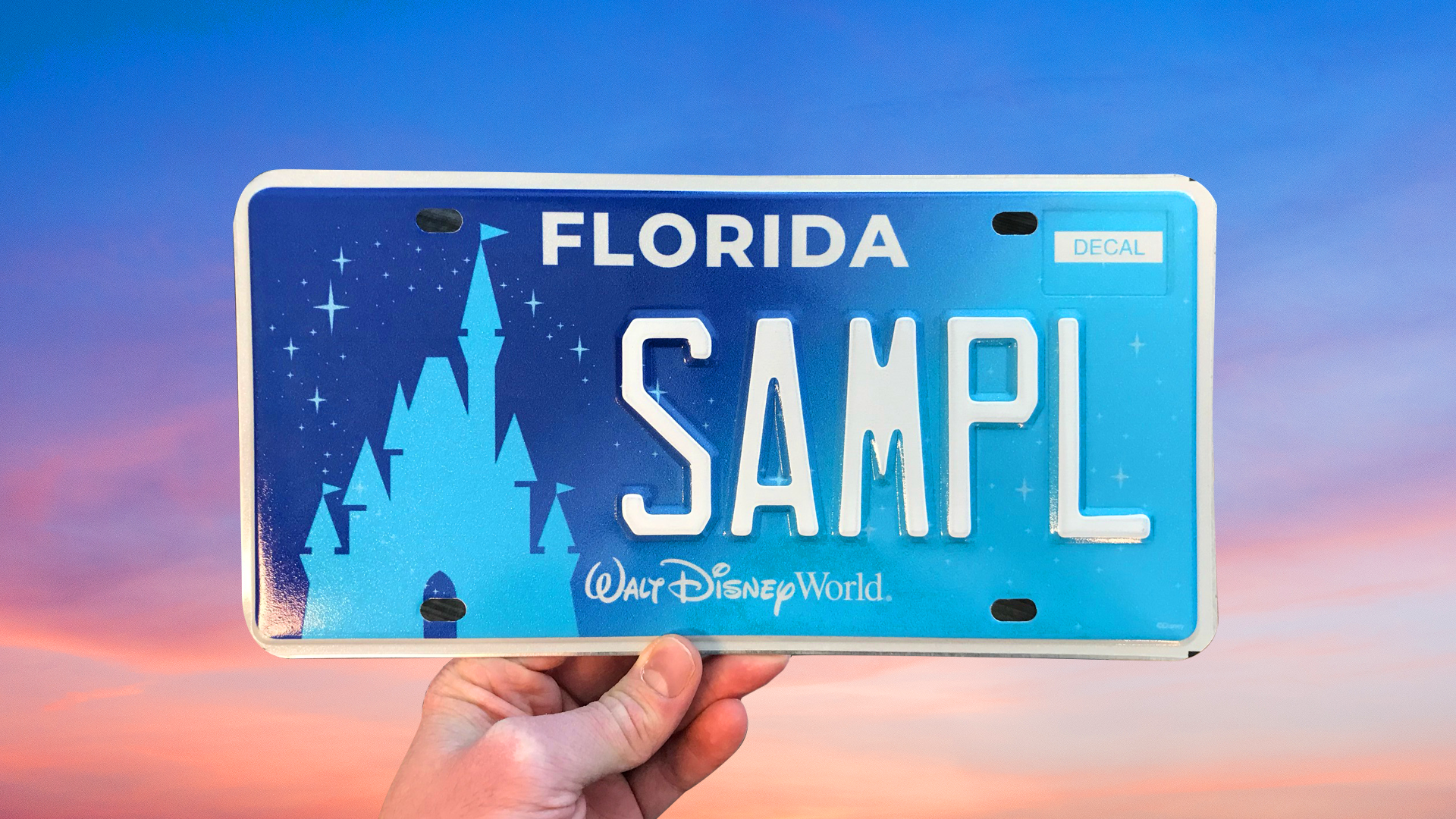
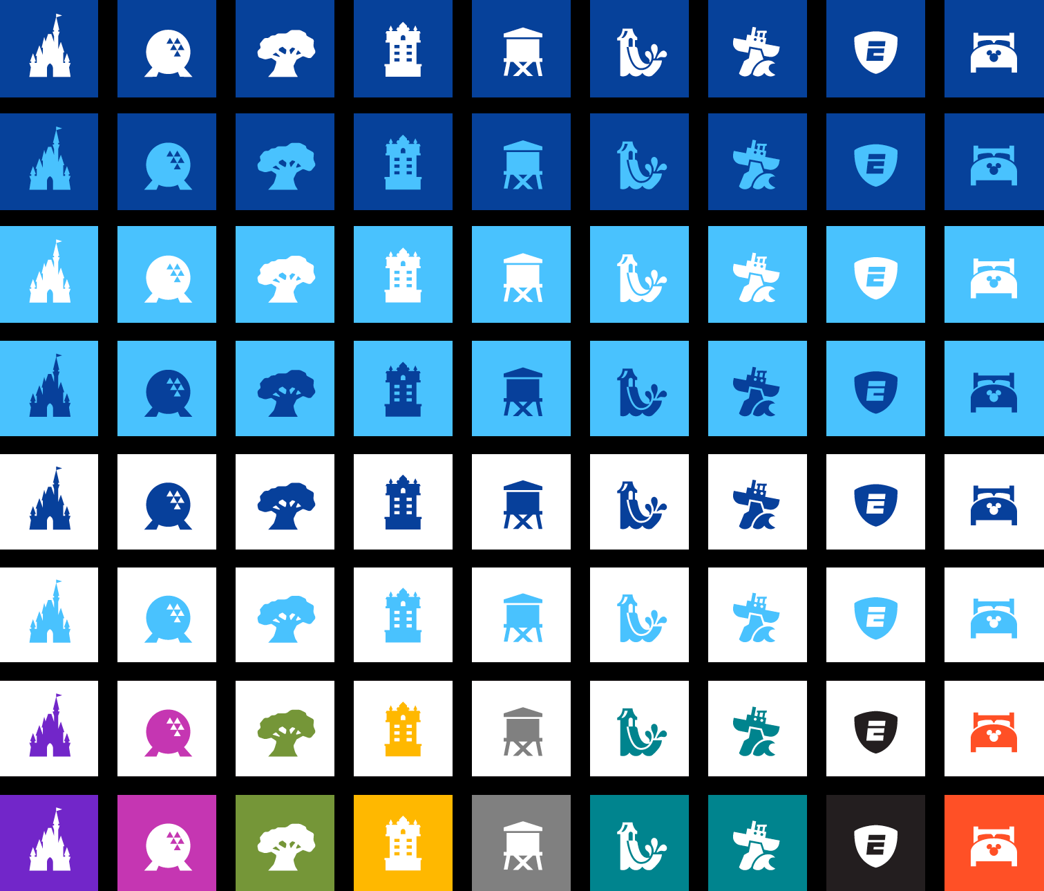
The first key element was designing a new castle logo mark. Referencing old logos, we found the balance of an enormous structure that also simplified down to an easily understood icon. That icon quickly made its way everywhere, from social media, TV spots and even to Florida license plates.
I even got to design a Florida license plate with the new logo on it.
Next came the color palette. How do you tie in four different parks, each with a full spectrum of unique colors throughout their unique landscapes, into one unified brand?
Our solution was to give Walt Disney World "everblue" colors that would represent the site as whole, but that also worked as tertiary colors for each individual park. Then we gave each park a primary and secondary palette that tied best into its unique theming and IP.
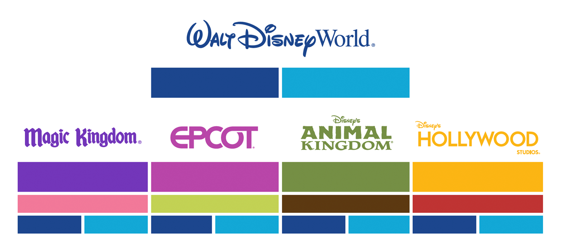
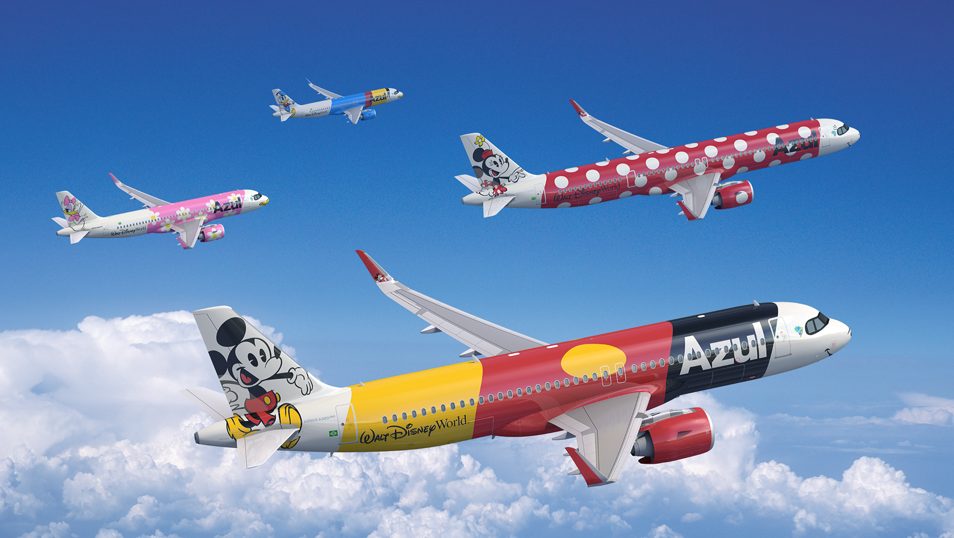
Working hand in hand with Imagineering to match the architecture's profile, we took the style from the castle icon and applied it to our 4 parks and 5 additional destinations. After which, we applied the same principles of color across the board and establish color rules to mandate which colors could be paired and which to avoid.
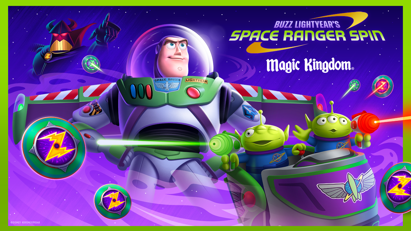
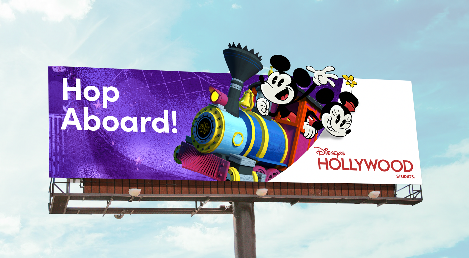
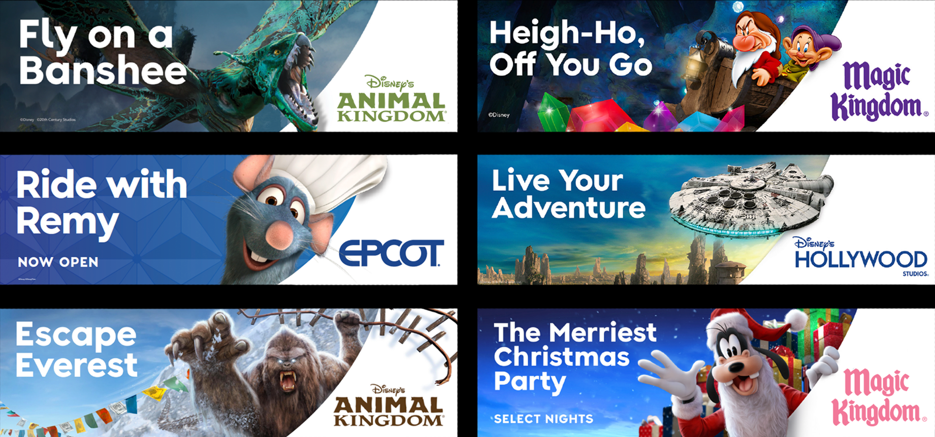
A major touchpoint that Yellow Shoes covers is OOH boards. I helped design the template to unify our boards for optimum readability and recognizably.
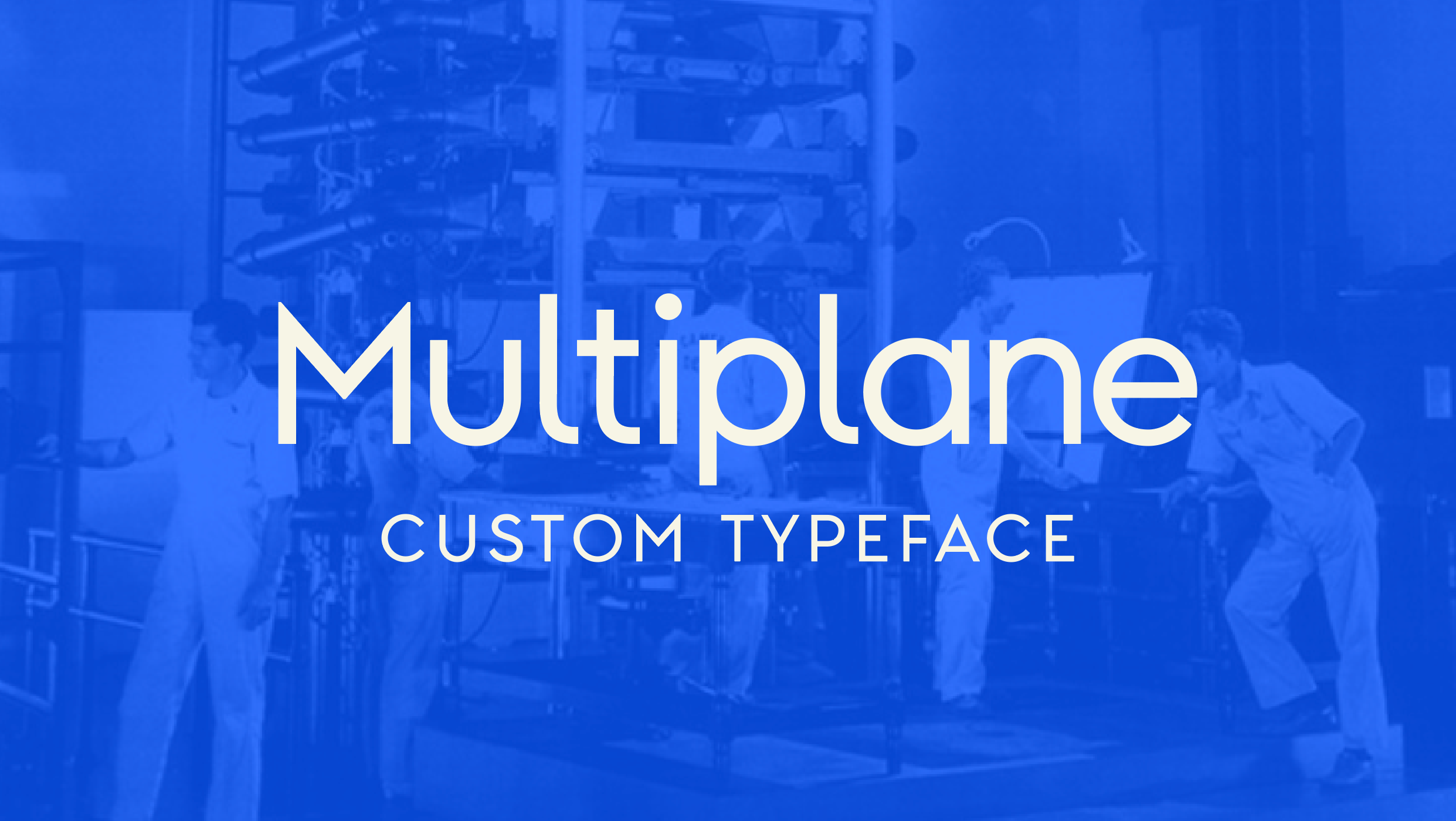
By applying the new color palette, proprietary typography (see Multiplane page), and the new graphic styling, we created a harmonious OOH template that worked well for our market and made it clear what each attraction was, and where to find it.
Finally, we needed a little pixie dust to help it all come together. Walt Disney World has never had "one way" to represent our signature sparkle, so we created a system for not only what the pixie dust should look like graphically, but how it should flow, animate, and when it should be used.

Designer: Connor King
Design Director: Will Gay
Group Design Director: Agnete Oernsholt
Account Management: Tony Mourino
Design Director: Will Gay
Group Design Director: Agnete Oernsholt
Account Management: Tony Mourino
WDI Partners: Jason Grandt, Debbie Petersen
Digital Partners: Silvia Sinlao, Eric Hansen, Matt Carthum
All Content: ©Disney
Digital Partners: Silvia Sinlao, Eric Hansen, Matt Carthum
All Content: ©Disney